Working in America over the decades
Jun 12, 2012 12:44 am • Permalink 
Information visualization firm Periscopic, in collaboration with GE, explores the makeup of the American workforce, from 1960 to present.
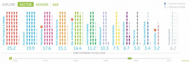
Jobs are definitely a top of mind subject. Did you know that manufacturing jobs were the largest sector of employment in 1960, yet today the category has fallen to 6th place? In this interactive visualization, browse who has been working in America over the past 50 years by sector, gender or age.
As in other Periscopic projects, the interactive provides multiple views that let you see the data from different angles. The initial view is a current breakdown of sectors, and when you press play, the visual rewinds to 1960, animating forward in time. Faded people icons represent the peak of each sector for context. Then as you might guess, the people rearrange themselves accordingly when you select breakdowns by age or gender.
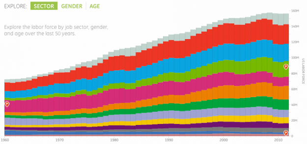
You can also have a look at the entire trend via stacked bar graph.

The stacked view is hard to decipher actual differences because of the vertical offset, but never fear. When you click on a category you get a year-to-year comparison between 1960 and now. Good work as usual, Periscopic.

When the world sleeps, based on Twitter activity
Jun 11, 2012 07:13 am • Permalink 
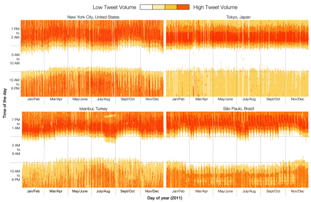
Twitter engineers Miguel Rios and Jimmy Lin explored tweet volumes in different cities and found some interesting tidbits about how people use the service.
We see different patterns of activity between the four cities. For example, waking/sleeping times are relatively constant throughout the year in Tokyo, but the other cities exhibit seasonal variations. We see that Japanese users' activities are concentrated in the evening, whereas in the other cities there is more usage during the day. In Istanbul, nights get shorter during August; Sao Paulo shows a time interval during the afternoon when Tweet volume goes down, and also longer nights during the entire year compared to the other three cities.
Notice the break during Ramadan in Istanbul?
Related

Losing American Community Survey would be 'disastrous'
Jun 11, 2012 04:00 am • Permalink Many want to get rid of the American Community Survey, a Census program which releases region-specific data annually. University of Michigan professor William Frey explains why cutting the survey would be a mistake.
Related

No comments:
Post a Comment