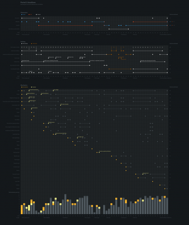
I've never played Portal 2 (or the first), but I suspect some of you will find these timelines by designer Piotr Bugno interesting.
As a fan of Valve's Portal 2 video game, I designed this infographic led by my curiosity to get a better grasp on its plot, on how mechanics informed the gameplay, and on the development of its main themes — good vs evil, descent vs ascent, destruction vs construction.
Seriously, all meaning is lost for me on these. Any Portal 2 fans care to chime in?


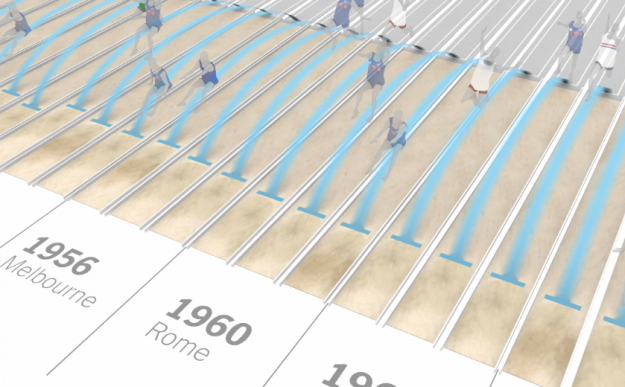
We've been hearing Olympic records rattled off for the past week, but it's hard to grasp just how great these athletes are performing. I mean, we know they're doing amazing things, but just how amazing? Kevin Quealy and Graham Roberts for The New York Times put it into perspective with two videos, one on the long jump and the other on the 100-meter sprint.
After I watched each, all I could think was, "Oh crap, that's good."
The videos frame distances and times in a way that's immediately relatable, such as a basketball court to show how far medals winners jumped or how far previous sprinters would be behind Usain Bolt. Smooth transitions move you through different perspectives and pauses give focus to the most notable athletes, and although each video covers a lot of information, you never feel disoriented. They cover the overall picture, down to the individual, and back again.
Good stuff. Give 'em a watch.


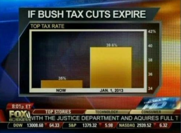
Fox News tried to show the change in the top tax rate if the Bush tax cuts expire, so they showed the rate now and what'd it be in 2013. Wow, it'll be around five times higher. Wait. No.
The value axis starts at 34 percent instead of zero, which you don't do with bar charts, because length is the visual cue. That is to say, when you look at this chart, you compare how high each bar is. Fox News might as well have started the vertical axis at 34.9 percent. That would've been more dramatic.
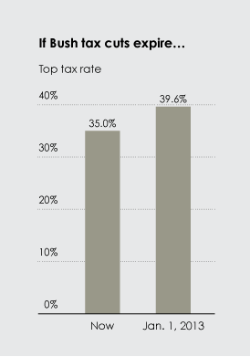
Here's what the bar chart is supposed to look like:

With a difference of 4.6 percentage points, the change doesn't look so crazy.
[via Effective Graphs]

No comments:
Post a Comment