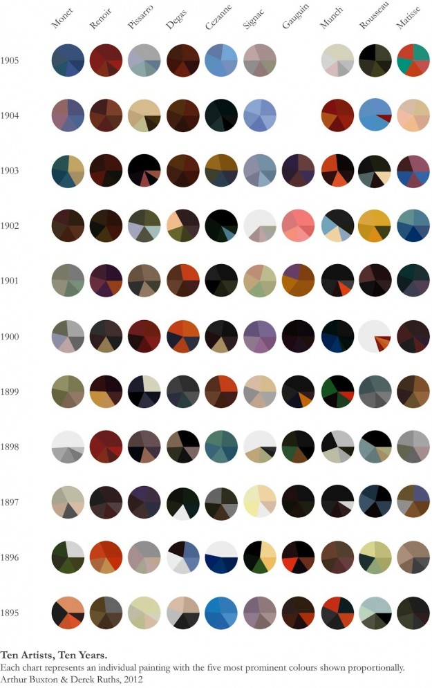
Expanding on his Vincent van Gogh pie charts, Arthur Buxton minimalized famous paintings from ten artists into more of everyone's favorite chart type. The color distribution of each pie represents the five most used shades in each painting. Like the first time around, you're either loving this or foaming at the mouth.  
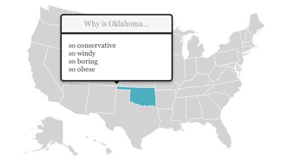
Renee DiResta got to wondering about state stereotypes, so she looked them up on Google and mapped them. In the months before a US Presidential election, the quality of political discourse hits new lows. Blue State/Red State tropes dominate the news cycle as the media gins up outrage over perceived injustices in the culture wars. It's all about our differences. So I started wondering, how do Americans really think about "those people" in other states? What are the most common stereotypes? For each of the fifty states and DC, I asked Google: "Why is [State] so " and let it autocomplete. It seemed like an ideal question to get at popular assumptions, since "Why is [State] so X?" presupposes that X is true.
Roll over a state on the map, and the top four suggestions are listed. Hilarity ensues. "Why is California so... liberal, broke, anti-gun, and expensive?" [via @rachelbinx]  | | | |
No comments:
Post a Comment