| | What seven billion people looks like Dec 05, 2011 12:12 am • Permalink 
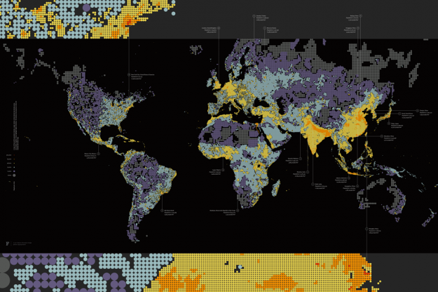
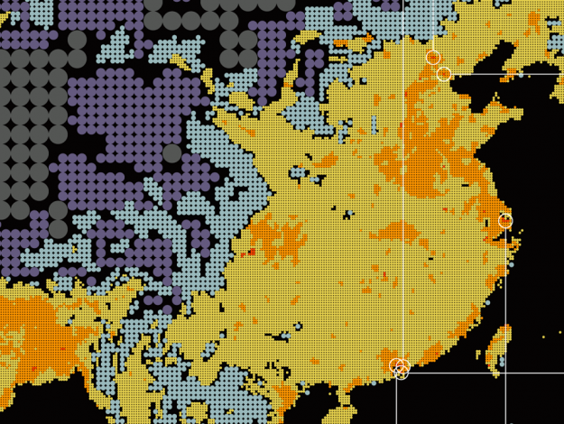
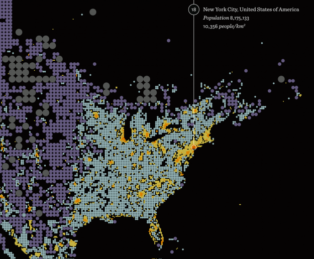
Form design intern at Fathom, James Grady, maps population density in Dencity: Dencity maps population density using circles of various size and hue. Larger, darker circles show areas with fewer people, while smaller, brighter circles highlight crowded cities. Representing denser areas with smaller circles results in additional geographic detail where there are more people, while sparsely populated areas are more vaguely defined.
While we've seen population density mapped, both directly and indirectly, the circle approach adds a different aesthetic that seems to add something about what it's like to live somewhere. Compare to a broader country-level map or one that uses only color. Doesn't this version feel like more? 

[Fathom via Fast Company]  | | More to read:
| |
No comments:
Post a Comment