App shows what the Internet looks like
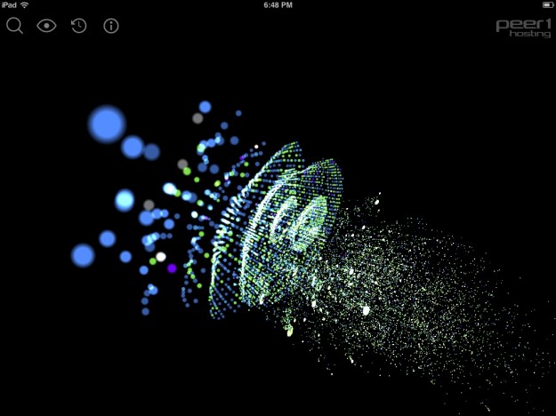
In a collaboration between PEER 1 Hosting, Steamclock Software, and Jeff Johnston, the Map of the Internet app provides a picture of what the physical Internet looks like.
Users can view Internet service providers (ISPs), Internet exchange points, universities and other organizations through two view options — Globe and Network. The app also allows users to generate a trace route between where they are located to a destination node, search for where popular companies and domains are, as well as identify their current location on the map.
I can't say how accurate it is or if the described mechanisms are accurate, but it sure is fun to play with. The view above and a globe are placed a three-dimensional space, and you can zoom and rotate as you please. There's also a time slider, so you can see changes to the Internet over the years.
Get it for free on iTunes.
A CNNMoney segment of the app in action:
Other ways to follow FlowingData
With Google Reader closing its doors in July (which stinks because I use it multiple times per day), now is a good time to make a switch.
For those who want to stick with RSS, you can grab the feed here. Note the change in feed URL. I used to use a service called Feedburner to deliver the RSS, but that's owned by Google, too, so it's probably best to move away from there.
Then of course you can follow @flowingdata on Twitter.
Or Facebook.
Or Google+.
Or via daily or weekly email.
Feltron 2012 Annual Report
Today might be pi day, but yesterday was Feltron Report day. The theme this year is visual density — or maybe programmatic graphics. Either way, it looks mighty fine.
No comments:
Post a Comment