River flow simulation
Jun 14, 2012 12:54 am • Permalink 
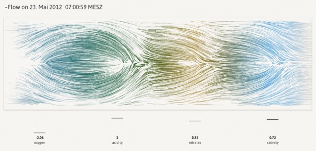
In Newcastle, there's a floating tide mill building on the River Tyne. The mill turns to generate power for the building, and in that flow of water are four sensors for oxygen, acidity, nitrates and salinity. Values for these metrics, along with wheel speed, are captured about every thirty minutes. Stephan Thiel of Studio NAND, in collaboration with Moritz Stefaner, visualized this data in an abstracted simulation of the flow through the tidemill.
Particles are continuously moving from right to left, being attracted or repelled by four circular zones representing the sensor values. The overall behavior of the particles is influenced by the turning speed of the waterwheel. If the value of one sensor is above its mean value, particles are repelled. If the value is below the mean, particles are attracted towards the center of the zone.
For example, if all four values are greater than the mean, you end up with four circular swells around these zones. In the above, oxygen is below the mean, so the simulated flows head towards the center of the oxygen zone instead of move around it like with the three zones before. So you end up with a sort of fingerprint for each window of data capture.
The data itself is probably of little interest to anyone who doesn't work at the mill, but the aesthetics of the piece is calming and certainly evokes the context of what the data represents.
The wind map by Wattenberg and Viegas and Drawing Water by Wicks come to mind.

Evolution of movie poster colors
Jun 13, 2012 10:44 am • Permalink 
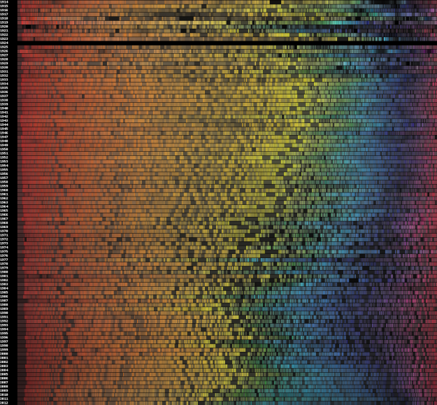
We've seen a number of looks at movie poster cliches, but this is the first time I've seen how the color of movie posters have changed over time. Vijay Pandurangan downloaded 35,000 poster thumbnails from a movie site, counted the color pixels in each image, and then grouped them by year and sorted by hue.
Some thoughts from Pandurangan's designer friend Cheryle Cranbourne:
The movies whose posters I analysed "cover a good range of genres. Perhaps the colors say less about how movie posters' colors as a whole and color trends, than they do about how genres of movies have evolved. For example, there are more action/thriller/sci-fi [films] than there were 50-70 years ago, which might have something to do with the increase in darker, more 'masculine' shades."
There's no mention of the blanked out 1924. That must've been a sad year. Oh wait, there were movies during that year, so there was either a massive ink shortage or it's just missing data.
[via @DataPointed]
Related

No comments:
Post a Comment