Where people are looking for homes
Jan 06, 2012 12:06 am • Permalink 
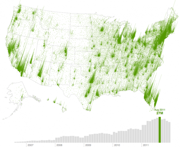
In August 2006, real estate search site Trulia had 609,000 visitors. Five years later, there were 27 million. Trulia's most recent visualization shows this growth (bottom bar graph) and where people are searching for homes (map). Press play and watch it go. It's pretty much population density, but for me, the method is more interesting than the material in this case.
The grass aesthetic is kind of nice. It looks like you have a one pixel blade of grass for each zip code with a significant search count (If only there was something to provide scale...), and where there's more search there's more grass.
I also like the relatively simple tech behind the graphic. We usually see animated and interactive maps generating everything on the fly, but the maps and bar graphs for this are pre-generated for each month. Then each image is displayed one after the other chronologically like a flip book.
[Trulia via @shashashasha]

[Members Only] Build Interactive Time Series Charts with Filters
Jan 05, 2012 09:45 am • Permalink When you have several time series over many categories, it can be useful to show them separately rather than put it all in one graph. This is one way to do it interactively with categorical filters.

Introducing FlowingData Membership
Jan 05, 2012 08:45 am • Permalink It was about five years ago when I got into visualization. Before I actually made anything, I read books and guides that made suggestions and preached a handful of design principles, but when it was time to make a data graphic for publication, I didn't know what I was doing. Theory is great. Being able to apply it to your own data is better.
Back then — which seems like forever but isn't actually that long ago — there weren't many practical tutorials or books on how to visualize data. Visualize This is the book I wish I had when I was starting out. A steady foundation and an introduction to what's out there, written to my old self.
There's still so much more to visualization though. There are different points of view to explore, new software and methods to try, and growing data sources to play with.
That's where FlowingData memberships come in. Having great sponsors lets me write tutorials and longer articles occasionally, but memberships will allow me to write more and perhaps bring in others' expertise from time to time.
Here's what you get with FlowingData membership:
- Monthly Tutorials: How to make and design publication-level data graphics.
- Downloads: Source code and files to use with your own data.
- Guides and Resources: Design principles and the best places to learn them.
- Curated Links: Hand-picked links from around the Web that focus on the how of visualization.
Those who have Visualize This will recognize the style of the guides and tutorials (first members-only tutorial coming soon after this post). You can also check out past tutorials for a taste. Long-time readers will notice a new layout that's easier to follow, and writing online lends itself better to more code-heavy projects.
All this for the introductory price of $25 per year — less than a coffee a month. I'll also throw in a warm, fuzzy feeling from directly supporting an independent FlowingData. Your support helps ensure that the lights stay on, hopefully for years to come.
Become a member.
UPDATE: Paypal is acting up. Looking into it now.
UPDATE 2: Seems to be going okay again. It might take a couple of tries due to your awesomeness.

No comments:
Post a Comment