Pie step comment bubble 3D thing
Jan 10, 2012 01:06 am • Permalink 
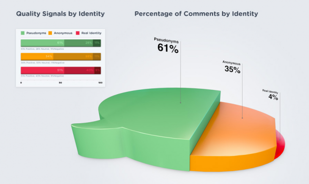
This graphic by commenting platform DISQUS, arguing that higher quality online discussions come from those using pseudonyms, splits the percentage of comments by identity into pseudonyms, anonymous, and real names. Is it a bubble chart? A pie? A coincidental bowl of jello? Actually, it looks like the height of each section represents the three values, so it's a misshapened bar chart of sorts. Oi.
It's trying so hard to look good that it comes across clunky and awkward.
If anything, they should have focused on the quality signals data on the left. Wouldn't that have been more interesting? Have at it in the comments.
[DISQUS via @miguelrios]

Designing Google Maps
Jan 10, 2012 12:29 am • Permalink 
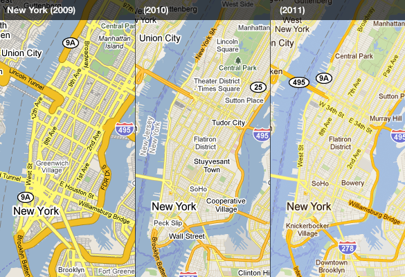
Google Maps is one of Google's best applications, but the time, energy, and thought put into designing it often goes unnoticed because of how easy it is to use, for a variety of purposes. Willem Van Lancker, a user experience and visual designer for Google Maps, describes the process of building a map application — color scheme, icons, typography, and "Googley-ness" — that practically everyone can use, worldwide.
We have worked (and driven) around the world to create a "map" that is a collection of zoom levels, imagery, angles, and on-the-ground panoramas all wrapped into one. Through these varied snapshots of our world, we are attempting to sew together a more seamless picture of the Earth—from its natural beauty to the surprising (and often absurd) details that make it our unique home. As our work progresses, new technologies give us the opportunity to get away from the limitations and complexity of standard cartography to provide a much more approachable and easy-to-understand map, loaded with data and information.
Remember when we had to refresh the page to see more of map?
[Core77 via @awoodruff]

Map of Reddit
Jan 09, 2012 01:06 pm • Permalink 
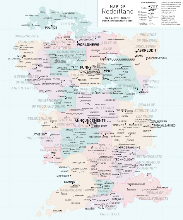
Reddit user Laurel Quade mapifies the wonderful world of Reddit. Each country represents an area of interest, and "cities" are sized by inhabitants. I'm not familiar enough with the communities to know how accurate it is, but judging by the comments, I'd say pretty good.
[Redditland via @adamsinger]

No comments:
Post a Comment