Algorithm estimates who's in control
Jan 04, 2012 12:10 am • Permalink John Kleinberg, whose work influenced Google's PageRank, is working on ranking something else. Kelinberg et al. developed an algorithm that ranks people, based on how they speak to each other.
"We show that in group discussions, power differentials between participants are subtly revealed by how much one individual immediately echoes the linguistic style of the person they are responding to," say Kleinberg and co.
The key to this is an idea called linguistic co-ordination, in which speakers naturally copy the style of their interlocutors. Human behaviour experts have long studied the way individuals can copy the body language or tone of voice of their peers, some have even studied how this effect reveals the power differences between members of the group.
Now Kleinberg and co say the same thing happens with language style.
That's why I just don't talk at all. Introvert to the max.
[Technology Review]

Hand-crafted wall map of the United States
Jan 03, 2012 11:15 am • Permalink 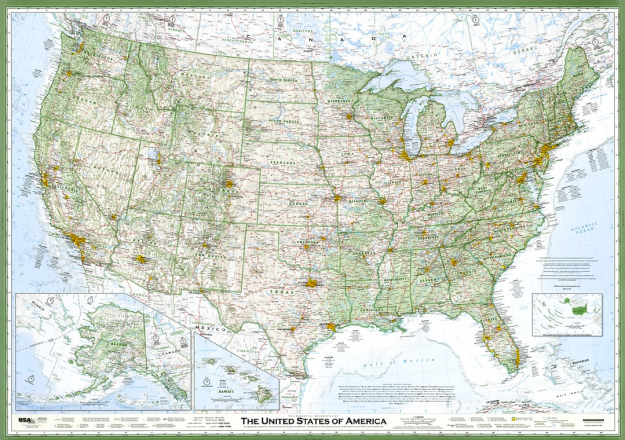
Seth Stevenson, for Slate Magazine, covers cartographer David Imus' hand-crafted wall map, which Stevenson calls the greatest paper map of the United States you'll ever see.
American mapmaking's most prestigious honor is the "Best of Show" award at the annual competition of the Cartography and Geographic Information Society. The five most recent winners were all maps designed by large, well-known institutions: National Geographic (three times), the Central Intelligence Agency Cartography Center, and the U.S. Census Bureau. But earlier this year, the 38th annual Best of Show award went to a map created by Imus Geographics—which is basically one dude named David Imus working in a farmhouse outside Eugene, Ore.
What makes it so good? Zoomed out, it doesn't look much different from other maps. Zooming in, however, you see something that was carefully crafted by hand. Below is a side-by-side comparison of Chicago on the Imus map (left) and a National Geographic map (right). Disregard the fuzziness in each, as that's the product of a scan. On one you have forestry shading, straight labels, and more emphasis on locations than on interstates. The other reads more like a road map.
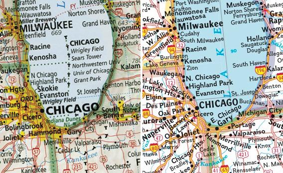
I'm not so much a cartographer as I am someone who puts data on maps, but I can appreciate the thought and care put into each placement like I can appreciate a data graphic designed by someone who knows their data well. Calling it the greatest ever is a tough sell though. I'd be interested to hear what you cartographers think.
The map is available in print at Imus Geographics. Hey, you can even get it laminated.
[Slate | Thanks, Claire]

Angry Birds productivity tracker
Jan 03, 2012 12:59 am • Permalink 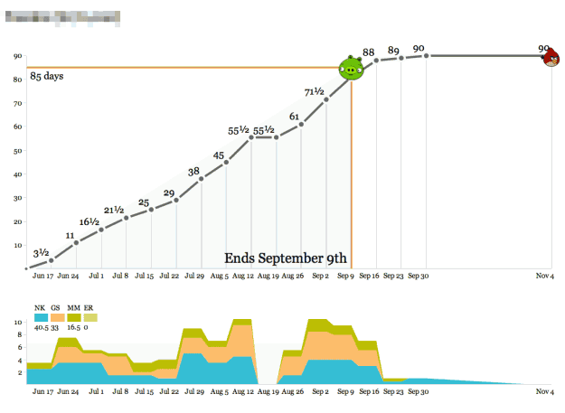
With the new year, many of you (myself included) and your employers resolved to be more productive this year. You are going to finish that side project. Learn that new language. Run that long distance. You are going to be all that you can be. Then you spent all day in front of the television yesterday while playing Angry Birds. Little did you know, productivity and Angry Birds go hand-in-hand.
Enter Productivity Birds, created and used internally by Stamen.
We've used these graphs as the simplest-possible visualization of how we spend our time so we know how we're doing relative to the budget for a project. Operationally, the data output of these graphs feeds directly into an accrued revenue model that lets us predict our income earlier. The day/week granularity makes it possible to collect the data as a team without making everyone unhappy with management overhead, and the bias toward whole- or half-day increments helps stabilize fractured schedules (not for me, though—my time is probably the most shattered of anyone in the studio).
Calendar time is represented on the horizontal axis and time spent on a project is the vertical. The object of the game is to hit the bird, where a bird over the pig means a risk of losing money, and a bird past the big means a risk of finishing late. The stacked area chart on the bottom shows who has been or is working on the project.
The small app, built with Protovis, is available on GitHub.
[tecznotes]

High-resolution maps of science
Jan 02, 2012 09:57 am • Permalink 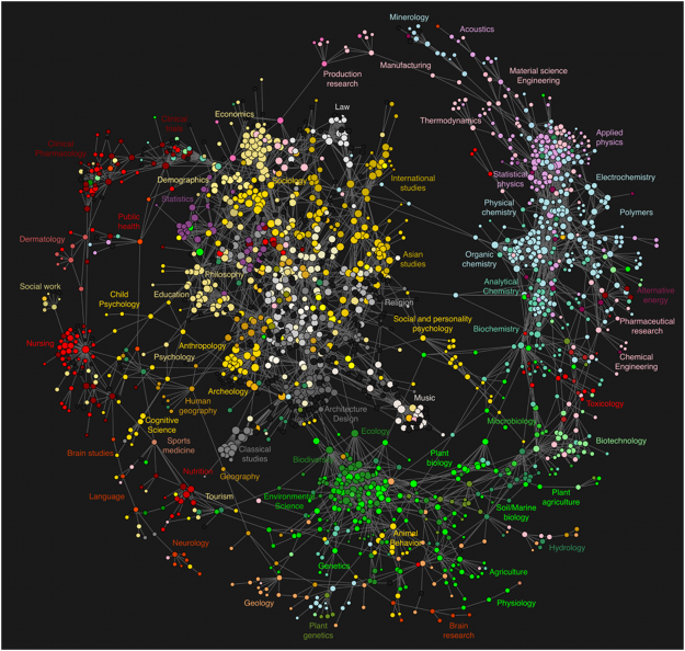
While we're on the topic of academic papers and how they're linked, Johan Bollen et. al used clickstream data to draw detailed maps of science, from the point of view of those actually reading the papers. That is, instead of relying on citations, they used log data on how readers request papers, in the form of a billion user interactions on various web portals.
Maps of science derived from citation data visualize the relationships among scholarly publications or disciplines. They are valuable instruments for exploring the structure and evolution of scholarly activity. Much like early world charts, these maps of science provide an overall visual perspective of science as well as a reference system that stimulates further exploration. However, these maps are also significantly biased due to the nature of the citation data from which they are derived: existing citation databases overrepresent the natural sciences; substantial delays typical of journal publication yield insights in science past, not present; and connections between scientific disciplines are tracked in a manner that ignores informal cross-fertilization.
Cross-fertilization. Saucy.
Each circle represents a journal and edges represent connections between journals, according to Johan Bollen et. al's clickstream model. Circles are color-coded by journal classifications from the Getty Research Institute's Art and Architecture Thesaurus.
So you have most of the engineering and physical sciences on the perimeter, medical-related areas to the left, and liberal arts is that middle cluster. Statistics is towards the top left, mixed in with demographics, philosophy, and sociology. There aren't many surprises in the clusters, but there are interesting, albeit weaker, links in the open spaces, such as religion and chemistry or music and ecology.
[PLoS ONE | Thanks, @drewconway]

Visualizing citations in research literature
Jan 01, 2012 10:09 pm • Permalink 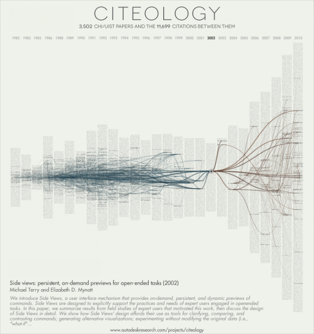
From Autodesk Research, Citeology is an interactive that visualizes connections in academic research via paper citations:
The names of each of the 3,502 papers published at the CHI and UIST Human Computer Interaction (HCI) conferences between 1982 and 2010 are listed by year and sorted with the most cited papers in the middle. In total, 11,699 citations were made from one article to another within this collection. These citations are represented by the curved lines in the graphic, linking each paper to those that it referenced.
The interactive repsonds slowly to clicks and only works in Firefox for me, but it's interesting to play around even if you aren't familiar with CHI and HCI papers. It works better if you select one to three generations instead of all. Click on a specific paper and you get citations for that paper on the right (brown) and the papers that the selected cited on the left (blue).
Color-coding for categories, authors, or subject could add another level of meaning to this. For example, do we see the subject evolve? Do papers that focus on a certain subject site outside of the main topic?
[Citeology via infosthetics]

Backbone of the flavor network
Dec 27, 2011 10:23 am • Permalink 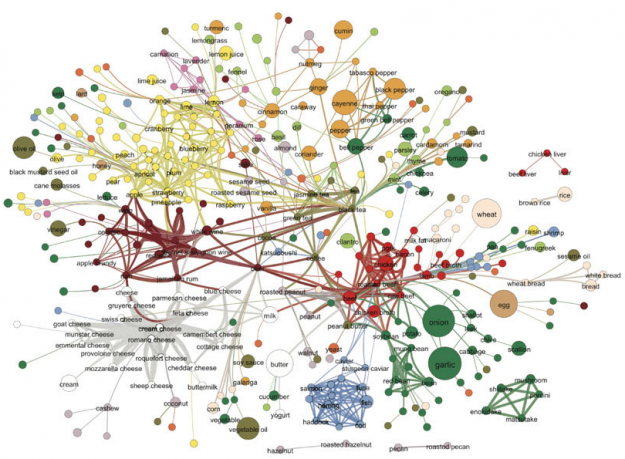
Food flavors across cultures and geography vary a lot. Some cuisines use a lot of scallion and ginger, whereas another might use a lot of onion and butter. Then again, everyone seems to use garlic. Yong-Yeol Ahn, et al. took a closer look at what makes food taste different, breaking ingredients into flavor compounds and examining what the ingredients had in common. A flavor network was the result:
Each node denotes an ingredient, the node color indicates food category, and node size reflects the ingredient prevalence in recipes. Two ingredients are connected if they share a significant number of flavor compounds, link thickness representing the number of shared compounds between the two ingredients. Adjacent links are bundled to reduce the clutter.
Mushrooms and liver are on the edges, out on their lonesome.
[Nature | Thanks, Elise]

Merry Christmas to you, from FlowingData
Dec 23, 2011 12:26 am • Permalink 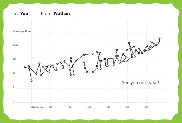
Thanks for making this a memorable year, everyone. Happy holidays!

Van Gogh for the colorblind
Dec 22, 2011 12:30 am • Permalink 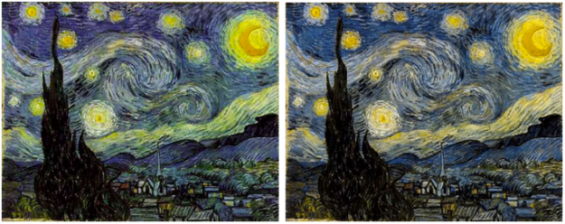
After a chat with his color deficient friends about how Vincent van Gogh's paintings seem to appeal to all eyes, Kazunori Asada used visual filters to see how the paintings looked to the colorblind. The experiment produced some interesting results and musings:
Was van Gogh partially color vision deficiency (anomalous trichromat)? Perhaps using a strong color vision deficiency (dichromat) simulation was the wrong approach. How about carrying out the simulation by removing the middle portion of normal color vision, maybe then I could see van Gogh's pictures in a better light?
The color choices for van Gogh's popular paintings seem less out there with the filters. The greens in the sky of Starry Night, for example turn to yellows.
A colorblind van Gogh though? Probably not. Either way, don't forget to pick your colors wisely. Asada has an easy-to-use tool to see what your own images look like to others.
[Asada's memorandum]

The Best Data Visualization Projects of 2011
Dec 21, 2011 12:54 am • Permalink 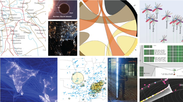
I almost didn't make a best-of list this year, but as I clicked through the year's post, it was hard not to. If last year (and maybe the year before) was the year of the gigantic graphic, this was the year of big data. Or maybe we've gotten better at filtering to the good stuff. (Fancy that.) In any case, data graphics continue to thrive and designers are putting more thought into what the data are about, and that's a very good thing.
So here are my favorites from 2011, ordered by preference. The order could easily scramble depending when you ask me.
1. Data-Driven Documents
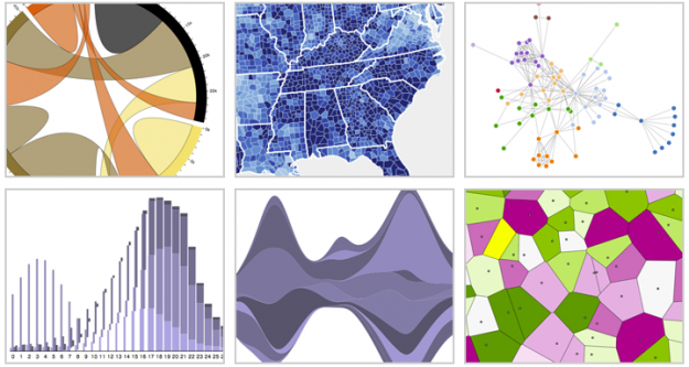
While creator Mike Bostock made the initial commit to GitHub in late 2010, D3 hit its stride in 2011. With Flash becoming less prevalent and HTML5 becoming more so, the lightweight JavaScript library is becoming many developers' choice when it comes to visualization on the Web. (I played around some, too.) This library is only going to get better come 2012.
2. Immaterials: Light Painting WiFi
Who knew carrying around a stick that detects WiFi vertically could be so informative? Mix in long-exposure photography, and the invisible networks all around look tangible. I feel silly putting this project so high on the list because it is so simple, but its simplicity is also part of why I like it so much.

3. A More Perfect Union
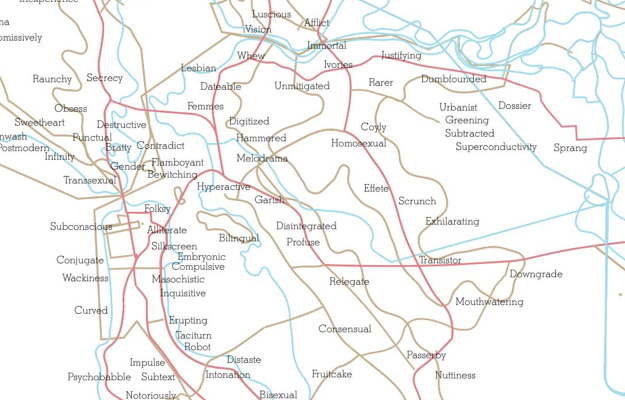
Media artist Roger Luke DuBois used online dating data to show the uniqueness of cities in America. In place of city names are the words that people in those cities used more often in their online dating profiles than anywhere else. The result was an exhibit mostly on paper, showing what set cities apart. It's not often that we get to see how geographic regions are unique at such a personal level.
4. Planetary
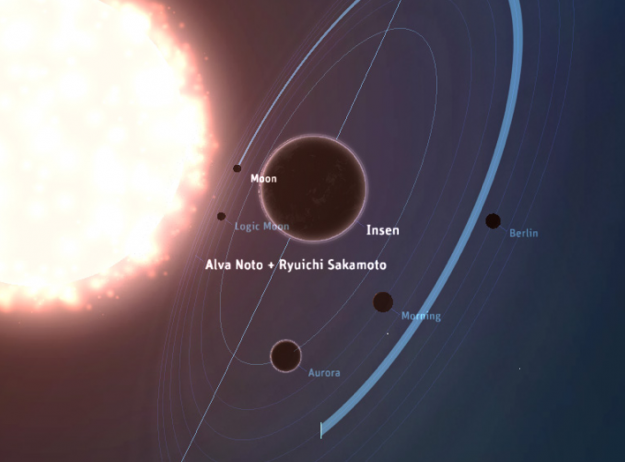
From Bloom, Planetary is an iPad app that visualizes your iTunes music as a solar system, bringing your data into a more playful and exploratory context. The solar system is your music collection, stars are artists, and planets are songs. Planetary was a hit at launch, and it's only a small sample of things to come I am sure.
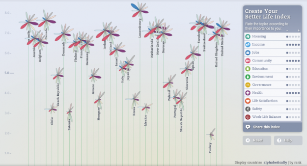
5. Better Life Index
The OECD has a lot of data about countries, and it can be hard to make all of data accessible at once. Moritz Stefaner and Raureif, in collaboration with the OECD, did this with the Better Life Index. You're even able to pick metrics to build an index yourself.
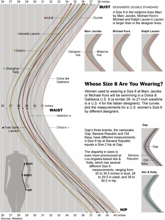
6. Whose Size 8 Are You Wearing?
This one from The New York Times amused me. My wife always has to try on so many jeans and once she finds a brand, she tends to stick with it for years. Now I get it. Sizes on women's clothing makes no sense.
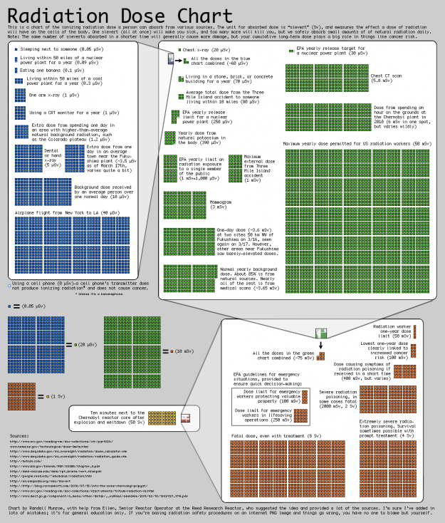
7. Radiation Dose Chart
With the troubles in Japan caused by mother nature, possible radiation hazards were in the news. Most accounts were anecdotal though, and a lot of numbers were thrown around. Randall Munroe of xkcd put together this chart to put it into perspective. What Munroe lacks in design tech he makes up with rigor.
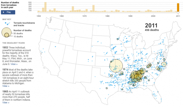
8. The Deadliest Years
Similarly, after the tornado in Joplin, Missouri killed more than 100 people, The New York Times put things into perspective. An animated and interactive map showed tornados and where they touched down, starting in 1950.
9. See Something or Say Something
The way that people use web services has gotten a lot more interesting with the growth of mobile tech. People aren't just interacting via a standing desktop anymore. Eric Fischer compared Flickr and Twitter usage in this series of maps. White indicates where people used both, blue is just Twitter, and orange is Flickr.

10. Visualizing Friendships
Facebook intern Paul Butler's map came out in 2010 just after I made my top picks for that year. The map shows the reach of Facebook, and more interestingly, I think, where Facebook isn't used. A number of follow-up maps came out of it. I also wrote a tutorial on how to do the same with your data.
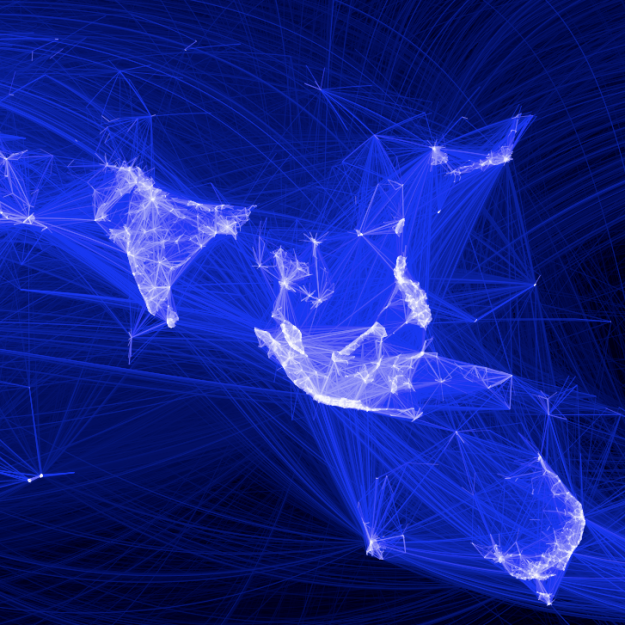
11. Global Fire Observations
NASA mapped tens of millions of fires worldwide over the course of a decade. Fires come, and forestry goes, and then comes back again. I was surprised the animation wasn't more popular when it came out. Probably would've spread a lot more with a little more production.
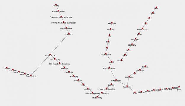
12. All Roads Lead to Philosophy
There was an idea floating around that if you continuously follow the first link on Wikipedia pages, you will always end up at philosophy. Jeffrey Winter put together a mashup to try out the idea, and whattaya know, everything does lead to philosophy. Well, almost everything.
13. Address is Approximate
While the short film about a lonely desk toy traveling cross-country via Google Streetview isn't exactly a data visualization, it deserves a shout. I mean, it uses maps, so that's enough. Just watch it.
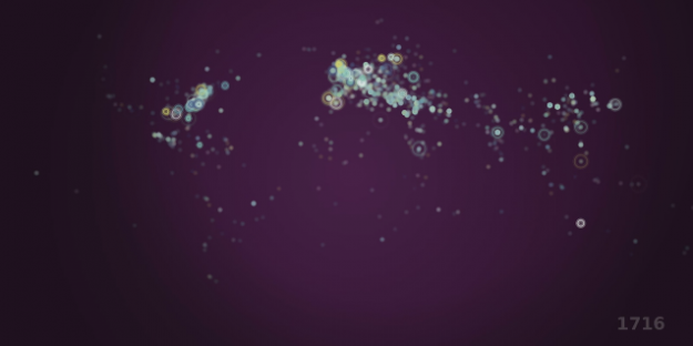
14. History of the World
Gareth Lloyd showed the history of the world in 100 seconds, using geotagged entries on Wikipedia. Because of that, the data has a slant towards Europe and the US, but it's interesting to watch nevertheless.
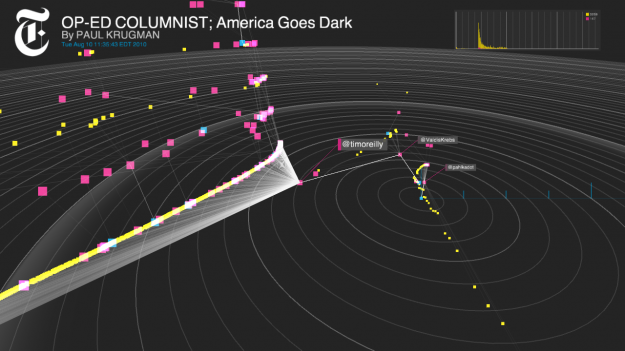
15. Project Cascade
Sharing on the Web is often depicted as time series charts and bar graphs, and measured by number of retweets and likes. There's more to it than that. The spread of a story is organic, a lot like how things spread in the physical world. Mark Hansen, Jer Thorp, and Jake Porway, as parts of the New York Times R&D Lab created Project Cascade to visualize how people share New York Times Stories.
Those are my picks for 2011. Your turn.

Record your movements with AntiMap
Dec 20, 2011 08:34 am • Permalink 
AntiMap is an open source toolset that lets you record movements with your iPhone or Android phone. Originally developed as a way for snowboarders to record their movements and play the data back like a video game, the toolset was generalized for all outdoor activities.
Simply collect data with your mobile, and then use one of the simple visualizations to see your data or do whatever else you want with it. It's your data. You get latitude, longitude, compass direction, speed, distance, and time, along with an optional input field to mark significant spots.
Here's a demo of the app in action:
With the new year coming up, this could be perfect for those who want to pull a Nicholas Felton.
[AntiMap | Thanks, Trent]

No comments:
Post a Comment