On low-quality infographics
Dec 08, 2011 12:58 am • Permalink This has been sitting in my drafts folder for a few months. Figured I'd just hit publish and throw it out there.
Obvious statement: there are infographics that are horribly made. Some are way too big for the information conveyed and others are useless because the creator had no idea what he was doing. Some infographics are both. Here's the thing though. There's plenty of suck of everything online, and yet somehow we manage to find the good resources, applications, and sources of endless entertainment.
A couple of years ago, infographics spiked and even what seems like subpar work now, passed as amusing at the least. It's like the time on the Web when it was pure awesome to have a site decked out with animated GIFs, blinking backgrounds, and delightful MIDIs that were a treat for the ears. Sites like this still exist — some just as an archive of the past and others by someone learning HTML with a book they checked out from the library — but you'd never mistake one of those sites as an example of great Web or interaction design.
Or how about blogs? It's as easy as ever to start one and you can write whatever you want. Some are bad and others are good. That's how it works when people make things.
Think of infographics/visualization/etc as a medium instead of a method and it should be much easier to unruffle your feathers. There are textbooks and there are novels. There are documentaries and there are slapstick comedies.
So I don't think a flood of low-quality infographics is going to obscure the work that is actually worth looking at. If anything, it's going to be easier to find the standouts.
I've seen this through my inbox already. Readers used to send me a lot of work that well, wasn't the best, but they thought it was interesting. That doesn't happen so much anymore though, because I think we've learned what was made as commercial linkbait and what deserves our attention. Sometimes they are one and the same, which is fine by me. Even if a piece looks beginner, it's easy to tell when a person is interested in the data or is eager to learn how to make things. I'm all for that and am more than happy to offer my two cents when someone asks me. After all, I'm still learning, too and I'll be producing plenty of schtuff in the process.
People can (or will learn to) spot the B.S., and the bad stuff doesn't get shared and doesn't spread.
When the low-quality infographics stop is when we should be most concerned. It means people have lost interest. That's not going to happen any time soon though.

Visualize This: Signed copies available
Dec 07, 2011 04:33 pm • Permalink Quick announcement: I have a handful of signed Visualize This copies available in case you're looking for a gift for that data geek cousin or you're up for some learning over the holidays. I only have a limited supply, so grab a copy before they're gone. And of course, you can still get an untarnished version at the major booksellers.

Rise and fall of riot rumors on Twitter
Dec 07, 2011 03:55 pm • Permalink 
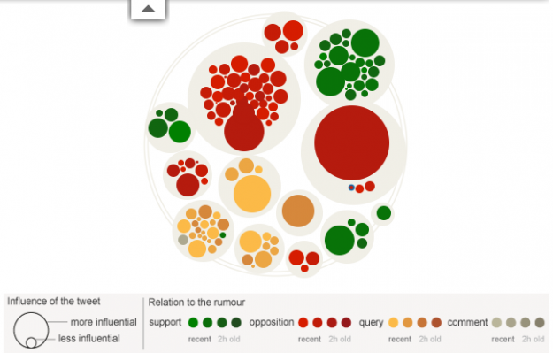
During the riots in London this past summer, a lot of information spread quickly about what was going on. Some of that information was true and some was not so true. The Guardian explores this spread of information on Twitter, and how fact and fiction seem to reveal themselves on their own:
A period of unrest can provoke many untruths, an analysis of 2.6 million tweets suggests. But Twitter is adept at correcting misinformation - particularly if the claim is that a tiger is on the loose in Primrose Hill.
Other rumors include when rioters cooked their own food at McDonald's (false), London Eye was set on fire (false), and Miss Selfridge was set on fire (true).
Each bubble represents a tweet and is sized by number of followers the tweeter has. The big one is usually the orignal tweet and the small ones that cluster around are retweets. Then the colors represent tweets that support, oppose, question, or comment. So when you play the animation for each rumor, bubbles swiftly pop up at the rumor peaks and then settle at true or false.
You can also use the scroll to move to a certain point in time, and roll over bubbles to see the tweets.
Really nice graphic and worth a look.
[Guardian via @jakeporway]

No comments:
Post a Comment