Corruption versus human development
Dec 09, 2011 12:57 am • Permalink 
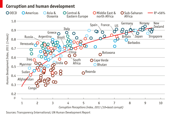
Transparency International released annual data for the Corruption Perceptions Index. The Economist plotted it against the UN's Human Development Index:
Comparing the corruption index with the UN's Human Development Index (a measure combining health, wealth and education), demonstrates an interesting connection. When the corruption index is between approximately 2.0 and 4.0 there appears to be little relationship with the human development index, but as it rises beyond 4.0 a stronger connection can be seen. Outliers include small but well-run poorer countries such as Bhutan and Cape Verde, while Greece and Italy stand out among the richer countries.
Interesting, although I suspect that the indices have some factors in common.
[The Economist via @mikeloukides]

Substratum: A series of interviews with smart people
Dec 08, 2011 09:49 am • Permalink It's always nice to hear from the people who are the best at what they do. Data visualization studio, Interactive Things has an interview series going, Substratum, that asks designers and artists the same set of questions. The most recent issue is with Amanda Cox from The New York Times and Nicholas Felton, who you know from his annual Feltron reports and now at Facebook.
Amanda Cox, the chart marker, on how her work and goals have changed over the years:
At one point — I call it my impressionist phase — I was really interested in making things abstract but interesting and beautiful. And then I had a "curves are fun" phase for a while where I was really into curved things. And then I had an "intentional simplicity" phase for a while, like, how stripped down can you make something and have it still be interesting? I don't know what my current phase is, but it's kind of an "aspirational reporting" phase. I'm not that great of a reporter yet, but I'm thinking a lot about how we can stop using the same information that's already on the Internet and just remix that. I want to start working with more, deeper information, information that's harder to surface.
This is coming from someone who has won an international award for being the best. So much to learn, I have.
[Substratum]

Bach Cello Suites visualized
Dec 08, 2011 03:09 am • Permalink As a resident at Eyebeam, Alexandar Chen visualizes the first Prelude from Bach's Cello Suites:
Using the mathematics behind string length and pitch, it came from a simple idea: what if all the notes were drawn as strings? Instead of a stream of classical notation on a page, this interactive project highlights the music's underlying structure and subtle shifts.
Interaction version here. Charming.
[Alexander Chen via @blprnt]

No comments:
Post a Comment